Install the app
How to install the app on iOS
Follow along with the video below to see how to install our site as a web app on your home screen.

Note: This feature currently requires accessing the site using the built-in Safari browser.
-
New here? Register here now for access to all the forums, download game torrents, private messages, polls, Sportsbook, etc. Plus, stay connected and follow BP on Instagram @buckeyeplanet and Facebook.
You are using an out of date browser. It may not display this or other websites correctly.
You should upgrade or use an alternative browser.
You should upgrade or use an alternative browser.
Jersey / Uniform Discussion (OSU)
- Thread starter buckeyeinfla
- Start date
Muck
Enjoy Every Sandwich
I tend to agree with Mili on this.Nike had zero say in the design. We tell them what we want and they make it for us...simple as that.
Nike isn't going to lose the contract to sell Ohio State gear by pushing something the school doesn't want.
Agreed.I sure hope 1460 was wrong when they were talking about grey stripes on the roadies... the helmet stripes actually work on that jersey.
God help me but I actually like that a bit.I think it's already in this thread but ok:

*shame*
Of course it would look like ass with the pants.
Upvote
0
the (potential) new away jerseys are just fine (color wise), and there is an appeal in the grey... but there is not a good pant color to match with that alternate look. This new look clearly lends itself to alternate jerseys, which would be a travesty IMO. The grey jersey above would make a good jersey to buy, but would make for a meager overall uniform, and would screw with tradition.God help me but I actually like that a bit.
*shame*
Of course it would look like ass with the pants.
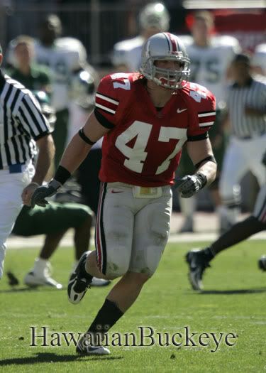
Per mili's request in the graphic forum thread, I threw this together... obviously our new jersey has changed, but it gives you an idea of how they could have kept grey in our home jerseys. A helmet, number and pant combo in shiny grey would look outstanding imo...

Upvote
0
hawaiianbuckeye
Where's YOUR Gold Pants?
the (potential) new away jerseys are just fine (color wise), and there is an appeal in the grey... but there is not a good pant color to match with that alternate look. This new look clearly lends itself to alternate jerseys, which would be a travesty IMO. The grey jersey above would make a good jersey to buy, but would make for a meager overall uniform, and would screw with tradition.
Per mili's request in the graphic forum thread, I threw this together... obviously our new jersey has changed, but it gives you an idea of how they could have kept grey in our home jerseys. A helmet, number and pant combo in shiny grey would look outstanding imo...

I could VERY MUCH deal with silver numbers over the current stripe on the 'new' home jersey!
HAYN
Upvote
0
Muck
Enjoy Every Sandwich
the (potential) new away jerseys are just fine (color wise), and there is an appeal in the grey... but there is not a good pant color to match with that alternate look. This new look clearly lends itself to alternate jerseys, which would be a travesty IMO. The grey jersey above would make a good jersey to buy, but would make for a meager overall uniform, and would screw with tradition.
Per mili's request in the graphic forum thread, I threw this together... obviously our new jersey has changed, but it gives you an idea of how they could have kept grey in our home jerseys. A helmet, number and pant combo in shiny grey would look outstanding imo...
Agree pretty much 100%
Upvote
0
Josh, while you're in the tinkering mood  , how about doing the silver/grey numbers with white trim on the replica jersey to see what it would look like?

 , how about doing the silver/grey numbers with white trim on the replica jersey to see what it would look like?
Upvote
0
hawaiianbuckeye
Where's YOUR Gold Pants?
The AWAY jerseys work, the HOME ones do not! JMO
HAYN
Upvote
0
I guess spielman better start wearing halter tops then...Girls comment on whether or not they like the uniforms, men worry about the performance of the team wearing them. When its game time your not even going to notice the uniforms.
Upvote
0


