Install the app
How to install the app on iOS
Follow along with the video below to see how to install our site as a web app on your home screen.

Note: This feature currently requires accessing the site using the built-in Safari browser.
-
New here? Register here now for access to all the forums, download game torrents, private messages, polls, Sportsbook, etc. Plus, stay connected and follow BP on Instagram @buckeyeplanet and Facebook.
You are using an out of date browser. It may not display this or other websites correctly.
You should upgrade or use an alternative browser.
You should upgrade or use an alternative browser.
Filters
Show only:
Upvote
0
2023 PA LB Ta’Mere Robinson (Penn State Verbal)
- By Buckeye86
- Football Recruiting
- 8 Replies
They have four lane split highways with a 45mph speed limit because they are too lazy or cheap to make proper on-ramps. The state sucks for that alone.PA is a senseless state
Upvote
0
Snoop's Dogs?
- By 5 STAR U-G-A
- Open Discussion (Work-safe)
- 2 Replies
These hot dogs will go 187 on your colon!
Some Gin & Juice will help with the swelling. Or at least numb the pain.
Upvote
0
Official Opt-Out Thread 2021-2022 Bowl Season
- By ScriptOhio
- College Football
- 78 Replies
The media would have had his head and I'm not even talking Birmingham media. They may have tried to go back to 1843. Following this author's thought process, the NIL dealers better have some language in there saying you will play in bowl/playoff game or forfeit money. And the players better have some bonus money in their contract if they make the CFP or NY6 games.
I agree. It makes sense for the NIL dealers to a have financial incentive for the player to complete the season/bowl game. It could be something similar to what I believe some have now with a void the contract clause if the player transfers to another school, etc.
In addition, the bowls should provide these players with an insurance policy for loss of potential NFL income due to an injury in their bowl game.
Upvote
0
247/Rivals/etc National and Regional Rankings
- By MSURacerDT55
- College Football
- 25 Replies
After signing the #1 overall prospect in the country, CB Travis Hunter, Jackson State just got a commitment from the #44 overall prospect in the country, WR Kevin Coleman. Deion Sanders making some historic signings at an FCS school.
This is exactly what I was doing on NCAA 14 (I cannot wait for the new one BTW)
Upvote
0
2021 CFB Playoff Discussion
- By JCOSU86
- 2021 Football Season Capsule
- 1770 Replies
You know, I have to say I couldn’t stand Georgia fans before I saw that
and I still can’t
Upvote
0
Seats at the Schott?
- Buckeye Basketball
- 0 Replies
Greetings! Double OSU alumnus here, currently stuck living in That State Up North (booooooo, although I'm moving back to my native NW Ohio soon). I haven't visited campus since an early-season 2012 football game, and I haven't been to a men's hoops game in even longer. I'm looking to take my Dad to the Maryland game on Feb. 6, and I'm just wondering if I should drop a few hundy on decent seats, or if it'd be possible for us to move down from the nosebleeds. Any insight is greatly appreciated! Go BUCKS!!! 

Bowl Games Thread
- By ScriptOhio
- 2021 Football Season Capsule
- 2909 Replies
College football: Top 10 most important wins from bowl season
1. ROSE BOWL
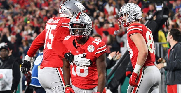
FINAL SCORE: Ohio State 48, Utah 45
From a pure entertainment perspective, this was easily the best game of bowl season. We can definitively put the “Ohio State didn’t care” narrative to rest. The Buckeyes that did take the field following a rash of opt outs played their hearts out to win in a prestigious bowl. Jaxon Smith-Njigba shattered bowl game records with an outstanding performance. Young receivers like Marvin Harrison Jr. emerged as potential future stars. This game allowed Ohio State fans to turn an eye towards the future, one which is incredibly bright. If it can get the defense sorted — and new coordinator Jim Knowles absolutely should — then Ohio State should be in the national championship conversation next year.
4. PEACH BOWL
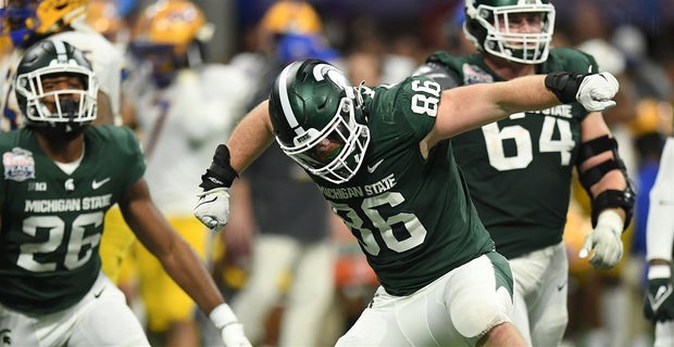
ATLANTA, GEORGIA - DECEMBER 30: Drew Beesley #86 of the Michigan State Spartans reacts after a sack during the third quarter against the Pittsburgh Panthers during the Chick-Fil-A Peach Bowl at Mercedes-Benz Stadium on December 30, 2021 in Atlanta,
FINAL SCORE: Michigan State 31, Pittsburgh 21
The Peach Bowl proved two things that are crucial for the future of Michigan State football: One, that the Spartans can win without Kenneth Walker and two, that this year was not a fluke. Mel Tucker is the real deal. This is Michigan State’s biggest postseason accomplishment since the Big Ten title in 2015. Sure, the Panthers were missing some pieces. So was Michigan State. With Payton Thorne back and running back transfer Jalen Berger headed to East Lansing, it could be time to buy stock in this program.
Entire article: https://247sports.com/college/ohio-...-wins-from-bowl-season-180477009/#180477009_7
Just sayin': Jalen Berger might not be Kenneth Walker 2.0:
Coming out of Don Bosco Preparatory High School in Ramsey, NJ, Berger was a four star running back and was ranked fifteenth nationally among running backs in the 2020 class by 247 Sports. Berger had offers to play at schools like Alabama, Florida, Michigan, Michigan, and Wisconsin. Ultimately, he committed to play football at the University of Wisconsin for head coach Paul Chryst.
There were flashes that Berger could become the lead-back as he finished with 60 carries for 301 yards and two touchdowns, which led the Badgers. Against the Michigan Wolverines, Berger finished the game as the Badgers lead rusher with 15 carries for 88 yards and one touchdown.
Fast-forward to now and Berger finished the 2021 season with only 88 yards and he’s headed for East Lansing, Mich. seeking a new opportunity. This year, freshman running back Braelon Allen became the Badgers’ biggest threat in the backfield as he rushed for 1,109 yards and averaged 7.1 yards per rush.
Entire article: https://www.si.com/college/ucf/college-football-news/berger-michigan-state
1. ROSE BOWL

FINAL SCORE: Ohio State 48, Utah 45
From a pure entertainment perspective, this was easily the best game of bowl season. We can definitively put the “Ohio State didn’t care” narrative to rest. The Buckeyes that did take the field following a rash of opt outs played their hearts out to win in a prestigious bowl. Jaxon Smith-Njigba shattered bowl game records with an outstanding performance. Young receivers like Marvin Harrison Jr. emerged as potential future stars. This game allowed Ohio State fans to turn an eye towards the future, one which is incredibly bright. If it can get the defense sorted — and new coordinator Jim Knowles absolutely should — then Ohio State should be in the national championship conversation next year.
4. PEACH BOWL

ATLANTA, GEORGIA - DECEMBER 30: Drew Beesley #86 of the Michigan State Spartans reacts after a sack during the third quarter against the Pittsburgh Panthers during the Chick-Fil-A Peach Bowl at Mercedes-Benz Stadium on December 30, 2021 in Atlanta,
FINAL SCORE: Michigan State 31, Pittsburgh 21
The Peach Bowl proved two things that are crucial for the future of Michigan State football: One, that the Spartans can win without Kenneth Walker and two, that this year was not a fluke. Mel Tucker is the real deal. This is Michigan State’s biggest postseason accomplishment since the Big Ten title in 2015. Sure, the Panthers were missing some pieces. So was Michigan State. With Payton Thorne back and running back transfer Jalen Berger headed to East Lansing, it could be time to buy stock in this program.
Entire article: https://247sports.com/college/ohio-...-wins-from-bowl-season-180477009/#180477009_7
Just sayin': Jalen Berger might not be Kenneth Walker 2.0:
Coming out of Don Bosco Preparatory High School in Ramsey, NJ, Berger was a four star running back and was ranked fifteenth nationally among running backs in the 2020 class by 247 Sports. Berger had offers to play at schools like Alabama, Florida, Michigan, Michigan, and Wisconsin. Ultimately, he committed to play football at the University of Wisconsin for head coach Paul Chryst.
There were flashes that Berger could become the lead-back as he finished with 60 carries for 301 yards and two touchdowns, which led the Badgers. Against the Michigan Wolverines, Berger finished the game as the Badgers lead rusher with 15 carries for 88 yards and one touchdown.
Fast-forward to now and Berger finished the 2021 season with only 88 yards and he’s headed for East Lansing, Mich. seeking a new opportunity. This year, freshman running back Braelon Allen became the Badgers’ biggest threat in the backfield as he rushed for 1,109 yards and averaged 7.1 yards per rush.
Entire article: https://www.si.com/college/ucf/college-football-news/berger-michigan-state
Upvote
0
Northwestern @ #13 tOSU, Sun Jan 8, 5:30 ET on BTN
- By nomatta
- Buckeye Basketball
- 87 Replies
If that graph Shetuck posted in another thread applies in basketball, expect them to become even more "sluggish" on defense in coming weeks as COVID aftermath takes hold.
Well... that's not good!
Upvote
0
2021 College Football Polls
- 2021 Football Season Capsule
- 314 Replies
Should have dropped then.Maybe, but USC beat Penn State in the 2017 Rose Bowl.
Upvote
0
#13 Ohio State @ Indiana, Jan 6th, 7pm EST, FS1
- By Arch2H
- Buckeye Basketball
- 57 Replies
Just watched this game. Indiana was awesome in the last 9 minutes, they could do no wrong.
Upvote
0
Ohio State Signees
- By LordJeffBuck
- College Football
- 1 Replies
Given the prevalence of the Transfer Portal in college football, I am going to include transfers as part of each recruiting class.
Upvote
0
Ryan Stamper (Director of Player Development)
- By jakenick06
- Buckeye Alumni
- 15 Replies
I wholeheartedly agree that some of the heat being applied to both lines lack of push and toughness had some how missed Marotti from what I saw. I’ll def be interested if any change in this area is made.I found it and at least one of the sources of speculation about needing a refresh in the S&C department.
https://www.elevenwarriors.com/ohio-state-football/the-situational/2022/01/128423/21-below
It seems plausible to me that Marroti isn’t on the same level of excellence without Meyer, and either way I think it’s possible that his style just might not be connecting with players as effectively these days.
Upvote
0
Major programs with most individual player awards
- By BB73
- College Football
- 82 Replies
Updated for these 2021 awards.
Walter Camp POY (Kenneth Walker III, Sparty), Doak Walker RB (Walker, Sparty), Biletnikoff Receiver (Jordan Addison, Pitt), Outland Interior Lineman (Jordan Davis, Georgia), Davey O'Brien QB (Bryce Young, Bama), Ray Guy Punter (Matt Arraiza, San Diego St), Thorpe DB (Coby Bryant, Cincy), Lou Groza PK (Jake Moody, TTUN), Bednarik Defensive (Jordan Davis Georgia), Nagurski Defensive (Will Anderson, Bama), Mackey TE (Trey McBride, Colo St), Maxwell POY (Young, Bama), Wuerrfel (Isaiah Sanders, Stanford), Rimington Center (Tyler Linderbaum, Iowa), Unitas Golden Arm (Kenny Pickett, Pitt), Hendricks DE (Aidan Hutchinson, TTUN), Butkus LB (Nakibe Dean, Georgia), Campbell Academic (Charlie Kolar, Iowa St), Heisman (Young, Bama), Manning (TBA), Lott Impact (Hutchinson, TTUN), Lowe's CLASS (Kenny Pickett, Pitt), Lombardi (Hutchinson, TTUN)
2021 summary so far: 4 for Bama (3 for Young, 1 got Anderson); 4 for TTUN (3 for Hutchinson, 1 for Moody); 3 for Pitt (2 for Pickett, 1 for Addison); 3 for Georgia: (2 for Davis, 1 for Dean); 2 for Sparty (Walker); 1 each for Iowa, San Diego St, Colorado St, Iowa St, Stanford, and Cincy.
2021 not awarded yet - Manning
Note - I only did this for these 19 teams.
Note - No longer counting O'Brien's that went to Earl Campbell in '77, Billy Sims in '78 (It was basically a SWC award until 1980, Singletary won in '79 and '80, then in '81 it was changed to strictly a QB award)
Note - removed 2005 Heisman
Walter Camp POY (Kenneth Walker III, Sparty), Doak Walker RB (Walker, Sparty), Biletnikoff Receiver (Jordan Addison, Pitt), Outland Interior Lineman (Jordan Davis, Georgia), Davey O'Brien QB (Bryce Young, Bama), Ray Guy Punter (Matt Arraiza, San Diego St), Thorpe DB (Coby Bryant, Cincy), Lou Groza PK (Jake Moody, TTUN), Bednarik Defensive (Jordan Davis Georgia), Nagurski Defensive (Will Anderson, Bama), Mackey TE (Trey McBride, Colo St), Maxwell POY (Young, Bama), Wuerrfel (Isaiah Sanders, Stanford), Rimington Center (Tyler Linderbaum, Iowa), Unitas Golden Arm (Kenny Pickett, Pitt), Hendricks DE (Aidan Hutchinson, TTUN), Butkus LB (Nakibe Dean, Georgia), Campbell Academic (Charlie Kolar, Iowa St), Heisman (Young, Bama), Manning (TBA), Lott Impact (Hutchinson, TTUN), Lowe's CLASS (Kenny Pickett, Pitt), Lombardi (Hutchinson, TTUN)
2021 summary so far: 4 for Bama (3 for Young, 1 got Anderson); 4 for TTUN (3 for Hutchinson, 1 for Moody); 3 for Pitt (2 for Pickett, 1 for Addison); 3 for Georgia: (2 for Davis, 1 for Dean); 2 for Sparty (Walker); 1 each for Iowa, San Diego St, Colorado St, Iowa St, Stanford, and Cincy.
2021 not awarded yet - Manning
| Award | 1st yr | tOSU | Okla | Tex | USC | Neb | ND | Bama | PSU | Fla | FSU | TTUN | UGA | LSU | Wisc | Aub | UCLA | Clem | Miam | Iowa |
|---|---|---|---|---|---|---|---|---|---|---|---|---|---|---|---|---|---|---|---|---|
| Heisman | 1935 | 7 | 7 | 2 | 6 | 3 | 7 | 4 | 1 | 3 | 3 | 3 | 2 | 2 | 2 | 3 | 1 | 0 | 2 | 1 |
| Maxwell | 1937 | 4 | 3 | 4 | 3 | 1 | 7 | 5 | 7 | 3 | 1 | 2 | 2 | 1 | 1 | 1 | 1 | 0 | 3 | 2 |
| Outland | 1946 | 4 | 5 | 3 | 1 | 9 | 4 | 6 | 1 | 0 | 0 | 0 | 2 | 1 | 2 | 2 | 2 | 0 | 2 | 4 |
| W. Camp | 1967 | 4 | 4 | 3 | 6 | 3 | 4 | 3 | 2 | 1 | 2 | 2 | 1 | 1 | 1 | 3 | 0 | 0 | 2 | 0 |
| Lombardi | 1970 | 6 | 3 | 3 | 1 | 5 | 5 | 2 | 2 | 0 | 2 | 2 | 1 | 2 | 0 | 2 | 0 | 0 | 1 | 0 |
| O'Brien | 1981 | 1 | 5 | 2 | 0 | 1 | 0 | 2 | 2 | 3 | 3 | 0 | 0 | 1 | 0 | 1 | 1 | 2 | 2 | 2 |
| Butkus | 1985 | 2 | 4 | 1 | 1 | 1 | 3 | 4 | 2 | 0 | 2 | 1 | 2 | 1 | 0 | 0 | 1 | 1 | 1 | 0 |
| Thorpe | 1986 | 2 | 3 | 2 | 2 | 0 | 0 | 2 | 0 | 1 | 2 | 1 | 1 | 3 | 1 | 1 | 0 | 0 | 1 | 1 |
| Unitas | 1987 | 0 | 1 | 1 | 3 | 1 | 2 | 3 | 0 | 1 | 3 | 0 | 0 | 1 | 1 | 0 | 1 | 1 | 2 | 0 |
| Doak Walker | 1990 | 1 | 0 | 4 | 1 | 0 | 0 | 3 | 1 | 0 | 0 | 1 | 1 | 0 | 5 | 0 | 0 | 0 | 0 | 1 |
| Campbell | 1990 | 2 | 0 | 2 | 0 | 2 | 0 | 1 | 1 | 3 | 0 | 0 | 1 | 1 | 0 | 0 | 0 | 1 | 1 | 0 |
| Groza | 1992 | 1 | 0 | 0 | 0 | 0 | 0 | 0 | 0 | 1 | 4 | 1 | 1 | 0 | 0 | 0 | 2 | 0 | 1 | 1 |
| Nagurski | 1993 | 2 | 2 | 2 | 0 | 1 | 1 | 2 | 0 | 0 | 0 | 1 | 1 | 1 | 0 | 0 | 0 | 1 | 2 | 0 |
| Bednarik | 1993 | 1 | 1 | 0 | 1 | 1 | 1 | 2 | 4 | 0 | 0 | 1 | 2 | 2 | 0 | 0 | 0 | 0 | 2 | 0 |
| Biletnikoff | 1994 | 1 | 1 | 0 | 1 | 0 | 1 | 3 | 1 | 0 | 0 | 1 | 0 | 2 | 0 | 0 | 0 | 0 | 0 | 0 |
| Tatupu | 1997 | 1 | 1 | 0 | 0 | 0 | 0 | 0 | 0 | 0 | 0 | 0 | 0 | 0 | 0 | 0 | 0 | 0 | 0 | 0 |
| Rimington | 2000 | 3 | 0 | 0 | 0 | 1 | 0 | 3 | 1 | 1 | 1 | 1 | 0 | 1 | 1 | 1 | 0 | 0 | 1 | 1 |
| Mackey | 2000 | 0 | 1 | 0 | 1 | 0 | 1 | 0 | 0 | 2 | 1 | 1 | 0 | 0 | 0 | 0 | 1 | 1 | 1 | 2 |
| Guy | 2000 | 1 | 0 | 1 | 0 | 0 | 0 | 0 | 0 | 1 | 0 | 0 | 1 | 0 | 1 | 0 | 0 | 0 | 0 | 0 |
| Hendricks | 2002 | 1 | 0 | 2 | 0 | 0 | 0 | 1 | 1 | 0 | 0 | 2 | 2 | 0 | 0 | 0 | 0 | 2 | 0 | 0 |
| Manning | 2004 | 0 | 2 | 2 | 1 | 0 | 0 | 1 | 0 | 1 | 1 | 0 | 0 | 2 | 0 | 1 | 0 | 2 | 0 | 0 |
| Lott | 2004 | 1 | 0 | 0 | 0 | 0 | 1 | 1 | 1 | 0 | 0 | 2 | 1 | 1 | 1 | 1 | 2 | 0 | 0 | 1 |
| Wuerffel | 2005 | 1 | 2 | 1 | 1 | 0 | 1 | 1 | 0 | 1 | 0 | 0 | 0 | 1 | 0 | 0 | 0 | 0 | 0 | 0 |
| Lowe's CLASS | 2008 | 1 | 0 | 0 | 0 | 1 | 1 | 0 | 1 | 1 | 0 | 1 | 0 | 0 | 0 | 1 | 0 | 0 | 0 | 0 |
| Award Totals | tOSU | Okla | Tex | USC | Neb | ND | Bama | PSU | Fla | FSU | TTUN | UGA | LSU | Wisc | Aub | UCLA | Clem | Miam | Iowa |
|---|---|---|---|---|---|---|---|---|---|---|---|---|---|---|---|---|---|---|---|
| Total Categories Won | 21 | 16 | 16 | 14 | 13 | 14 | 19 | 15 | 14 | 12 | 16 | 15 | 17 | 10 | 11 | 9 | 8 | 15 | 10 |
| Tot # Of Awards Won | 47 | 45 | 35 | 29 | 30 | 39 | 48 | 28 | 23 | 25 | 23 | 21 | 24 | 16 | 17 | 12 | 11 | 24 | 16 |
Note - I only did this for these 19 teams.
Note - No longer counting O'Brien's that went to Earl Campbell in '77, Billy Sims in '78 (It was basically a SWC award until 1980, Singletary won in '79 and '80, then in '81 it was changed to strictly a QB award)
Note - removed 2005 Heisman
Upvote
0
Play Game 2021 Bowl Upset Contest - Won by Jake
- By JCOSU86
- Buckeye Football
- 108 Replies
Don't you love it when a plan comes together?I finished in last place, so my strategy clearly worked exactly as intended.
Upvote
0
Upvote
0
Upvote
0
Official eyelid twitch thread
- By Onebuckfan
- Open Discussion (Work-safe)
- 3 Replies
Things that make my eyelid twitch political adds on TV. If someone had a filter to remove all of them. Up to $1000 a year I’d pay.
Upvote
0
nfl draft breakdown and tidbits
- By ScriptOhio
- Professional Football
- 1 Replies
NFL teams could lose draft pick, face fines for unprofessional conduct during draft prospect interviews
The NFL has issued a warning to teams that they could lose a draft pick and face significant fines if club representatives conduct themselves unprofessionally in interviews with draft prospects.
In a memo obtained by The Associated Press that was sent to clubs on Wednesday, the league said a team would forfeit a draft pick between the first and fourth round and be fined a minimum of $150,000 if it's determined a club representative displayed conduct that is "disrespectful, inappropriate, or unprofessional" during an interview. Fines and/or suspensions of individual club employees also could be imposed, according to the memo.
"We aim for dignity, respect and professionalism," league executive Troy Vincent told the AP. "It's that simple."
The league also plans to eliminate the Wonderlic test for prospective players, and it is revising some of its scouting combine drills to better simulate game-related movement. Wide receivers and tight ends will run crossing routes instead of wheel routes, and running backs will run option routes instead of corner and post-corner routes.
.
.
.
Over the past several years, there have been occasional reports of inappropriate questions being asked of draft prospects.
In 2010, then-Miami Dolphins general manager Jeff Ireland apologized to Dallas Cowboys first-round draft pick Dez Bryant for asking during a pre-draft visit whether his mother was a prostitute.
In 2016, then-Atlanta Falcons coach Dan Quinn apologized to Eli Apple because one of his coaches asked the cornerback his sexual preference.
In 2018, former LSU running back Derrius Guice said one team at the combine asked about his sexuality and another inquired if his mother was a prostitute.
Former NFL tight end Benjamin Watson, who played 16 seasons between 2004-20, compared the interview process to an interrogation.
"I can remember sitting in a dark room with a huge spotlight," Watson told the AP last year. "There's a seat there like you're being interrogated for a crime and all the front-office staff is in the back in the shadows and you can't see them. The guy grabbed my wrist and he's like: 'I can feel your pulse, so I know if you're lying to me. Have you ever smoked marijuana?' I said: 'No.' I really hadn't. I've never smoked. He said: 'I think you're lying. I can feel your pulse. Are you lying to us?' I said: 'No, I'm not.'
"So for a minute, I thought I actually did smoke marijuana and maybe I need to confess to a crime that I didn't commit. But these sorts of tactics that are happening at the combine and that are not being monitored definitely need to be done away with."
.
.
.
continued
Entire article: https://www.espn.com/nfl/story/_/id...rofessional-conduct-draft-prospect-interviews
Upvote
0
Upvote
0
MotS&G For The Roses
- News
- 0 Replies
For The Roses
Richard Tongohan via our good friends at Men of the Scarlet and Gray
Visit their fantastic blog and read the full article (and so much more) here
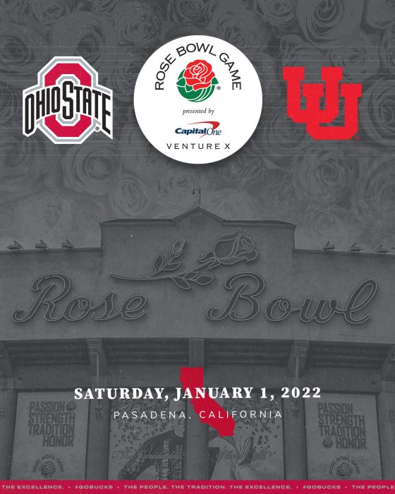
Photo Credit: Ohiostatebuckeyes.com
Keanu Reeves played a role as a former Ohio State Quarterback in The Replacements. In Shane Falco’s words: Pain heals. Chicks dog scars. Glory lasts forever. After being on the rare receiving end of a trashing from their arch rival Michigan, the Buckeyes find themselves outside of the big dance, without a conference title and wounded in the aftermath.
The wounds are still fresh but they’ve scabbed over. Now, in the form of a New Years Six bid, the Buckeyes will represent the BIG 10 in Pasadena at the Rose Bowl and they will square off against a gritty PAC 12 champ Utah team that had obliterated Oregon twice this season.
As it stands, the intentions of both Chris Olave and Garrett Wilson are unknown. If they play, it would most likely be their last appearance in the scarlet and gray. Although it is a huge “if”, I’ll keep hope that they’ll suit up one more time for their brothers to wash away the salt from a let down in Ann Arbor.
Currently, the Buckeyes are the slight favorites to win in what should be a great, competitive game. The Utes have their stout, stingy defense and the Buckeyes have their dynamic, explosive offense. These two teams combine the right ingredients to create an everlasting, memorable game for all the Roses.
According to the most reviewed sportsbooks at SportsBettingDime.com, the Buckeyes are 6.5 point favorites in this game. If they beat the Utes, the damage will likely be dealt with their passing prowess. With their trio of the nations best wideouts in Chris Olave, Garrett Wilson and Jaxon Smith-Njigba look to finish the season with a win.
This will be a stiff test, but the Buckeyes seem angry. They are sure talking like they’re taking this seriously as well but we will see. Again, this is a battle of wills, in the trenches. Utah has a similar play style to TTUN and they are also just as physical.
All in all, I am rolling with the Buckeyes in a close one. I am predicting Stroud to play out of his mind with or without Olave and Wilson. I am also predicting Henderson to make a splash with the O-Line reverting back to their early season form. As much as I love predicting blowout, I’ll predict a closer than expected score.
Prediction: Buckeyes over Utes 42-31


Continue reading...
Richard Tongohan via our good friends at Men of the Scarlet and Gray
Visit their fantastic blog and read the full article (and so much more) here

Photo Credit: Ohiostatebuckeyes.com
Keanu Reeves played a role as a former Ohio State Quarterback in The Replacements. In Shane Falco’s words: Pain heals. Chicks dog scars. Glory lasts forever. After being on the rare receiving end of a trashing from their arch rival Michigan, the Buckeyes find themselves outside of the big dance, without a conference title and wounded in the aftermath.
The wounds are still fresh but they’ve scabbed over. Now, in the form of a New Years Six bid, the Buckeyes will represent the BIG 10 in Pasadena at the Rose Bowl and they will square off against a gritty PAC 12 champ Utah team that had obliterated Oregon twice this season.
As it stands, the intentions of both Chris Olave and Garrett Wilson are unknown. If they play, it would most likely be their last appearance in the scarlet and gray. Although it is a huge “if”, I’ll keep hope that they’ll suit up one more time for their brothers to wash away the salt from a let down in Ann Arbor.
Currently, the Buckeyes are the slight favorites to win in what should be a great, competitive game. The Utes have their stout, stingy defense and the Buckeyes have their dynamic, explosive offense. These two teams combine the right ingredients to create an everlasting, memorable game for all the Roses.
According to the most reviewed sportsbooks at SportsBettingDime.com, the Buckeyes are 6.5 point favorites in this game. If they beat the Utes, the damage will likely be dealt with their passing prowess. With their trio of the nations best wideouts in Chris Olave, Garrett Wilson and Jaxon Smith-Njigba look to finish the season with a win.
This will be a stiff test, but the Buckeyes seem angry. They are sure talking like they’re taking this seriously as well but we will see. Again, this is a battle of wills, in the trenches. Utah has a similar play style to TTUN and they are also just as physical.
All in all, I am rolling with the Buckeyes in a close one. I am predicting Stroud to play out of his mind with or without Olave and Wilson. I am also predicting Henderson to make a splash with the O-Line reverting back to their early season form. As much as I love predicting blowout, I’ll predict a closer than expected score.
Prediction: Buckeyes over Utes 42-31
Continue reading...
Load more

