
Install the app
How to install the app on iOS
Follow along with the video below to see how to install our site as a web app on your home screen.

Note: This feature currently requires accessing the site using the built-in Safari browser.
-
New here? Register here now for access to all the forums, download game torrents, private messages, polls, Sportsbook, etc. Plus, stay connected and follow BP on Instagram @buckeyeplanet and Facebook.
You are using an out of date browser. It may not display this or other websites correctly.
You should upgrade or use an alternative browser.
You should upgrade or use an alternative browser.
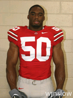
Jersey / Uniform Discussion (OSU)
- Thread starter buckeyeinfla
- Start date

aesculus glabra
officious intermeddler
we need a 'taser' chaser...
or you could have a 'pepper spray' chaser;
1.5 oz Absolut Peppar.
3-4 dashes of Cholula (or tabasco)
splash oj
splash grenadine
Not bad!!! I was just thinking about using sparklers.
Upvote
0
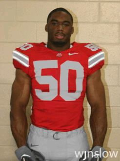
Uh, OK. They don't fuckin' rock. :pTell me the jersey w/grey numerals and white trim don't fuckin' rock...
I like the white letters/numbers.
Upvote
0
I think the gray letters would look better from a factory than photoshop... but for the record, this is still the jersey I wish had been created.
Upvote
0
Why does black have to dominate all of sports uniforms now??!
I have much more respect for teams sticking to their traditional colors even if they are ugly. Our colors are Scarlet and Grey! In this regard there is no reason to remove our colors, embelish them or highlight them if you must, but leave our colors alone!
Ok, done for now.
I have much more respect for teams sticking to their traditional colors even if they are ugly. Our colors are Scarlet and Grey! In this regard there is no reason to remove our colors, embelish them or highlight them if you must, but leave our colors alone!
Ok, done for now.
Upvote
0
They just need to throw those fuckers in the trash, go back to last years uni's, which would make 99.9% of us happy as hell, in addition to shutting down this thread. Peace.
Upvote
0
Ginn4Heisman20
I'm a universal constant
While beauty is in the eye of the beholder I think some of you are being a little overdramatic with your distaste for the new look. I agree that from I personal stand point it is nice to have some gray on the uniform. I don't wear hats, I don't have any gray pants, and as a fan I like to rock scarlet AND gray at the game. These new jersey's will make that a little more difficult. Be that as it may I think these will look great on the field and maybe just as good as the old ones.
I'll step up and play devil's advocate for the stripes. From a design standpoint the old stripes on the sleeves served no purpose other than to throw some gray onto the jersey(like I said before, great from the fan perspective). With both the helmets and pants screaming gray already it really isn't necessary to put more on the sleeves just for the sake of getting some more gray on there. The new sleeve striping now matches the striping on the pants and helmet thus making the color scheme more continuous. I don't see this change as being that big a deal. The tighter fit changes the look a lot as well but if that results in three or four more touchdowns this year I'm all for it.
The only modification I would really like to see at this point is unifying the shades of scarlet. There are now two tones and the non-mesh parts are a little too dark(i.e. shoulders and lower flank). Nike did this purposefully to draw attention to their technology but as fan I think it makes the look a little too futuristic. Changing those parts back to old school scarlet would make the look much more classic and fan friendly.
Ok, so in the end I'm really with the majority of you in that I preferred the old look. That being said, I really don't mind the new look. If anything it will give me a way to differentiate between my Ted Ginn jersey and my Chris Gamble jersey (which has been masquerading as a Ginn for too long). I understand that I'm in the minority of people who don't hate the new look. For those who pine for the old jerseys I can only offer this bit of comfort: once we get a win or two into the new ones the nausea will subside.
Upvote
0
AirForceBuck
No mercy
I think the gunslinging style QBs have the worst looking jerseys. The stripe and sleeves just looks TOO stupid and cheap:
<TABLE cellSpacing=0 cellPadding=5 width="95%" border=0><TBODY><TR><TD class=body align=middle>
 </TD></TR><TR><TD class=body align=middle>
Also, someone from fashions, PLEASE put some more grey into those pants, especially if you are going to take it all out of the jersey. Maybe go with a silver tint like they had in the 02 season.
</TD></TR></TBODY></TABLE>
<TABLE cellSpacing=0 cellPadding=5 width="95%" border=0><TBODY><TR><TD class=body align=middle>
Also, someone from fashions, PLEASE put some more grey into those pants, especially if you are going to take it all out of the jersey. Maybe go with a silver tint like they had in the 02 season.
</TD></TR></TBODY></TABLE>
Upvote
0
buckeye247
# 33
At least they are not like Vtechs and miam's last year or at least their alternates.
Upvote
0
AirForceBuck
No mercy
At least they are not like Vtechs and miam's last year or at least their alternates.
No but on the "gunslingers" style, the sleeve looks weird. It looked odd in the other pictures as well, like the number was slanted or something. It just looks disgusting. All of our QBs just need to fall in line and chop off the damn cloth around their arm. Henne, and Tate arent exactly "athletic" QB's, yet they went sleeveless.
Upvote
0

AirForceBuck
No mercy
Maybe Im the only one, but when I played ball in high school, I never required my cell.
Brent Musberger: "Please pardon the interuption folks, we will take a quick commercial break as Pittman calls a timeout to speak things over with his homeys on his celly."

Brent Musberger: "Please pardon the interuption folks, we will take a quick commercial break as Pittman calls a timeout to speak things over with his homeys on his celly."
Upvote
0
BuckeyeTillIDie
The North Remembers
Maybe Im the only one, but when I played ball in high school, I never required my cell.
it's safe to say the times have changed..
Upvote
0