Get a look at adidas’ new NHL jerseys for all 31 teams
The NHL's new partnership with adidas hit Las Vegas on Tuesday night to unveil the new uniforms that all 31 teams will be wearing beginning next season -- including Vegas' own expansion team, the Golden Knights.
All 31 squads put their home uniforms on display to celebrate the new partnership. Not every team made significant changes to their design -- in fact, a large number of teams stuck with a similar look -- but a few took the opportunity to refresh their look while shifting to adidas' advanced uniform technology.
Entire article:
http://www.foxsports.com/nhl/gallery/get-a-look-at-adidas-new-nhl-jerseys-for-all-31-teams-062017
Vegas' home uni's might be some of the best in the NHL.
FWIW, I've always liked the Wild's logo/jerseys (i.e. nature scene that looks like a wild animal's head):
View attachment 15675
My five favorite/least favorite--
Best:
I've always liked the Sabres sweaters, aside from the ones they wore in the late nineties with the black/red/silver scheme.
The Canucks seems to be polarizing, but I've always liked this design.
Can't stand the Blackhawks, but can't argue with this classic design. Home and away are very sharp.
Really like this design. It just screams "Minnesota" to me.
Like the Yankees pinstripes, and the Cowboys Star, it's a classic, understated design that is almost perfect.
Least favorite:
Gross.
Teal is always a bad idea.
BORING.
An improvement from their previous mess, but the gigantic howling coyote doesn't do it for me. At all.
I've always despised that maroon/blue color scheme. Doesn't go together at all.
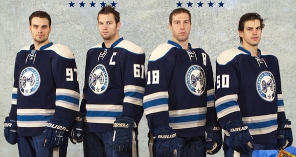
Incidentally, the CBJ alternate sweater is probably my favorite in all of hockey...
While I like the flag themed primaries, I wish they'd go with this design. I just think it's really sharp.


/cdn.vox-cdn.com/uploads/chorus_image/image/55979783/502275578.0.jpg)