OCBucksFan;2350426; said:
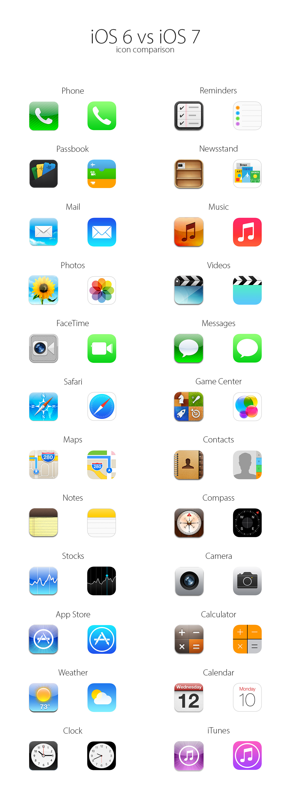
I think the main thing people don't like about the new icons isn't the icons itself, I have a dev license so I run IOS 7 beta on my ipad, it just doesn't look good when it's all combined is all. Nothing too tough for them to clean up. But I do look forward to the opportunities for them to fix jailbreaks with new IOS versions that say "Replaced blah blah blah icons to fit better with system" Also, undocumented, fixed that bug you used to jailbreak your phone.
I got anxious to get the new look on my jailbroken 4S and iPad, so I installed some iOS 7 themes and a ported version of the font. I can't be completely sure how faithful of a reproduction it is, but for the elements that do get themed it looks pretty close. I really love the look of the new icons and would have a hard time going back. That said, maybe they don't look as good when you look at them side-by-side. With the way I organize icons and folders, I only fill two rows per page with icons, group everything by category, and my stock icons get pretty scattered that way except in my dock. I don't really get to see them all side-by-side as you describe.
The main thing I've noticed with the new icons is that you need a good wallpaper to make it work. I've found that abstract patterns and bold colors work really well. Too dark, and it doesn't look good. Too light, and everything just blends into the background too much. When I say that it sounds like that's too restrictive, but the same was the case with the iOS 6 icons and UI, it was just different types of patterns and colors that worked best.
I think the people who are most upset are the people I read in blog comments who can't spell half of the words they type. They are the type that make liberal use of ugly themes or wallpapers already, use App Store apps with ugly slapdash icons or ugly UIs. To me, those things already stood out like a sore thumb on iOS. In the new iOS, those things are going to stand out even more. I realize there's a tinge of irony in me saying this since I just themed my phone... but look at the jailbreak themes that are out there. 99% of them are butt-ugly... as if people are still designing shitty Winamp skins on Windows ME.
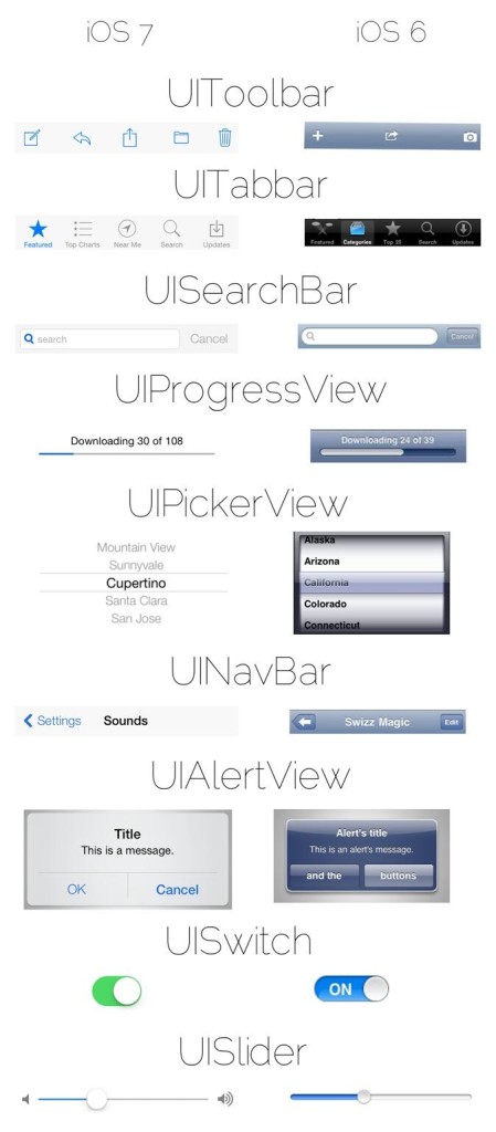
Going back to my comments about the new icons changing what works in terms of wallpapers, I think the new UI is going to change the way we look at apps, and is going to shake up what apps are looked at as the best of the best. Marco Arment (creator of Instapaper) blogged about this right after WWDC and said as much. In a way, it's a fresh start for the App Store. Most categories are flooded with apps and have established players at the top. Now everybody is going to have to change to fit in with the new look and feel of iOS, which means that new developers with new ideas can more easily get noticed if they are one of the first of that category to adopt the new style - especially if they do so ahead of the more established names. There are a few apps that are already out there that look like they fit in really well with what iOS 7 does. I'm interested to see how well they do in that new environment. (Feedly, Rdio, RunKeeper, CARROT, Mind Blitz and Dots are examples of what I'm thinking of.)


