
Install the app
How to install the app on iOS
Follow along with the video below to see how to install our site as a web app on your home screen.

Note: This feature currently requires accessing the site using the built-in Safari browser.
-
New here? Register here now for access to all the forums, download game torrents, private messages, polls, Sportsbook, etc. Plus, stay connected and follow BP on Instagram @buckeyeplanet and Facebook.
You are using an out of date browser. It may not display this or other websites correctly.
You should upgrade or use an alternative browser.
You should upgrade or use an alternative browser.
Jersey / Uniform Discussion (OSU)
- Thread starter buckeyeinfla
- Start date

rampageripster
Senior
Verdicts....
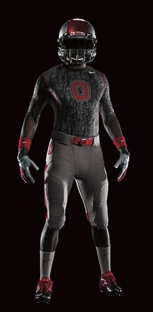
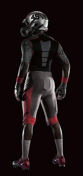
tOSU: Well, I would much rather Nike leave our jerseys alone... BUT... I really like these. The shoulder yoke looks sharp as well as the large font numbers. The helmet is at least historically accurate and doesn't have the weird facemask marks UGA did. I could do without the weird pants details... stick with an all gray with three thin red stripes. I get the buckeye grove thing, but it doesn't quite translate. Overall, I like it, especially because it is not black.
LSU: I really like this. It is basically what we expected. If you are gonna go StormTrooper, make sure that you at least stick with the uniform plan. Could do without the purple underarms and the pants are screaming for some sweet striping, but those are details...
Army: Not a big change from their usuals... but some neat deatils. Boots are sand printed to look like actual combat boots and the stencil font made to look like barracks stenciling... All in all a success... Just imagine if they had decided to go camo crazy...
Michigan St: Blech... that's supposed to be bronze, not gold, but it doesn't work at all. The green is far too dark, you can barely make out the wordmark on the front... and look at that, MSU has a tramp stamp... this is pretty awful
Navy: HOME FREAKIN RUN... I LOVE this... those helmets are incredible... I am shocked that Nike was able to nail simple yet modern... These will look amazing on the field in contrast to Army's... bravo Nike (not something you hear me say often)
Stanford: well... it was good while it lasted Nike... These are the worst of the bunch.. the jerseys themselves are boring... black doesn't stand out on what looks to be a darker shade than Cardinal (could be the lighting)... those helmets look lazy... this outfit screams "we didn't know what the fuck to do, so we just tossed black wherever there used to be white"... meh
Upvote
0
scooter1369;1989949; said:
The camo is so the critters don't see you, the Block O is so Bobby Knight doesn't shoot you, and the pads are there in case he shoots you anyway.
Upvote
0
ginn421
Think Long
Lot more pictures at OSU's official site:
http://www.ohiostatebuckeyes.com/sports/m-footbl/spec-rel/091311aaa.html
http://www.ohiostatebuckeyes.com/sports/m-footbl/spec-rel/091311aaa.html
Upvote
0
GeorgiaBuck2
Buckeye For Life
The only thing I have a complaint about is the tree bark. I don't like it.
I guess an underlying meaning is that our guys will be "hunting" badgers but it doesn't look very good, imo.
I guess an underlying meaning is that our guys will be "hunting" badgers but it doesn't look very good, imo.
Upvote
0
scooter1369
HTTR Forever.
GeorgiaBuck2;1989963; said:The only thing I have a complaint about is the tree bark. I don't like it.
I guess an underlying meaning is that our guys will be "hunting" badgers but it doesn't look very good, imo.
I wondered at first if these were designed by the guys at Real Tree or Field & Stream.
Upvote
0

FairfaxBuckeye
All-American
GeorgiaBuck2;1989963; said:The only thing I have a complaint about is the tree bark. I don't like it.
I guess an underlying meaning is that our guys will be "hunting" badgers but it doesn't look very good, imo.
I'm not a fan of the stripes on the pants. I don't like the stripe that doesn't go all the way to the belt line and that wraps around the back of the knee. I had the same issue with the 2009 version.
Upvote
0
FairfaxBuckeye
All-American
jwinslow;1989959; said:If I put a Benz hood ornament atop my car, then I can call it a Benz throwback.
I've never been a fan of how Nike and Ohio State try to spin these uniforms as some sort of tribute.
Upvote
0
GoBucks1014
Heaven on earth
I remember back in the early 90s when college teams started to switch to Nike uniforms. My roommate and I were so excited when tOSU announced in the mid 90s they were going to Nike for uniforms/shoes. 
Be careful what you wish for.
Be careful what you wish for.
Upvote
0
Taosman;1989962; said:Oh, fer christ sakes! Could it be any worse?

Just wait until next year, when we honor the 1922 team and have brown helmets painted to look like leather.
Upvote
0
ScarletnGray 33
Heisman
I was excited to see these... but I'm not a fan. The jerseys look like tee shirts, and the numbers are way too big.
Upvote
0