Install the app
How to install the app on iOS
Follow along with the video below to see how to install our site as a web app on your home screen.

Note: This feature currently requires accessing the site using the built-in Safari browser.
-
New here? Register here now for access to all the forums, download game torrents, private messages, polls, Sportsbook, etc. Plus, stay connected and follow BP on Instagram @buckeyeplanet and Facebook.
You are using an out of date browser. It may not display this or other websites correctly.
You should upgrade or use an alternative browser.
You should upgrade or use an alternative browser.
Uniforms (Nike, Under Armour, Adidas, etc....)
- Thread starter barlow1802
- Start date
CentralMOBuck
Assistant Coach
Helmets have no originality either. The new model is to slap some logo on one side, make it oversized, angle it and call it a day. Boise, ASU and Mizzou all follow the same pattern, but with a different logo. The alternative is to do something similar to those god awful helmets tOSU wore for the Game last year.
Upvote
0
CentralMOBuck;2324789; said:
I think those camo helmets would be cool if each helmet had a different pattern.
Asked a couple firends who are Hokie grads or current students there and none likes them...
Upvote
0
cincibuck
You kids stay off my lawn!
[Mili QUOTE]Asked a couple firends who are Hokie grads or current students there and none likes them... [/QUOTE]CentralMOBuck;2324789; said:
I think those camo helmets would be cool if each helmet had a different pattern.
As a military man what do you not like about creamed chipped hunks on barf? There's not much you can do to make orange and maroon uglier, but this is certainly one idea.
Upvote
0
Muck
Enjoy Every Sandwich
CentralMOBuck;2327293; said:Helmets have no originality either. The new model is to slap some logo on one side, make it oversized, angle it and call it a day. Boise, ASU and Mizzou all follow the same pattern, but with a different logo.
Don't forget 'gotta have one in flat black'.
he alternative is to do something similar to those god awful helmets tOSU wore for the Game last year.
Those were recycled too. Look at Georgia's 2011 alts.
Upvote
0
VBSJ
Hall of Fame
Seems like a lot of the Pac-12 schools are doing redesigns. Most (changing) are Nike schools.
Heck, Ohio State's changing its logo. Maybe it's a Nike thing.
http://blog.pac-12.com/cal-introduces-new-logo-visual-identity/
Alternative Cal logo

Heck, Ohio State's changing its logo. Maybe it's a Nike thing.
http://blog.pac-12.com/cal-introduces-new-logo-visual-identity/
Alternative Cal logo

Upvote
0
LovelandBuckeye
You never lose to those pricks. Ever. Ever. - UFM
VBSJ;2327415; said:Seems like a lot of the Pac-12 schools are doing redesigns. Most (changing) are Nike schools.
Heck, Ohio State's changing its logo. Maybe it's a Nike thing.
http://blog.pac-12.com/cal-introduces-new-logo-visual-identity/
Alternative Cal logo

More on their uniforms. Sorry, using iPad. Can't copy paste pics.
http://www.sbnation.com/college-football/2013/4/10/4209476/new-california-football-uniforms-2013
Upvote
0
ochre;2327486; said:the outline of that bear kind of looks like an evergreen tree.
 It does!
 Hmm...who's mascot is a tree and would Cal mind being mistaken for that school?
Upvote
0
VBSJ;2327415; said:Seems like a lot of the Pac-12 schools are doing redesigns. Most (changing) are Nike schools.
Heck, Ohio State's changing its logo. Maybe it's a Nike thing.
http://blog.pac-12.com/cal-introduces-new-logo-visual-identity/
Alternative Cal logo

Why the hell does this bear look like its crying?..Oh wait, he's representing Cal. I strike my question.
Upvote
0
VBSJ;2327415; said:Heck, Ohio State's changing its logo. Maybe it's a Nike thing.
Wait a minute, you mean to tell me that wasn't a bullshit hoax??
Upvote
0
LovelandBuckeye
You never lose to those pricks. Ever. Ever. - UFM
Pics from my previous post above.


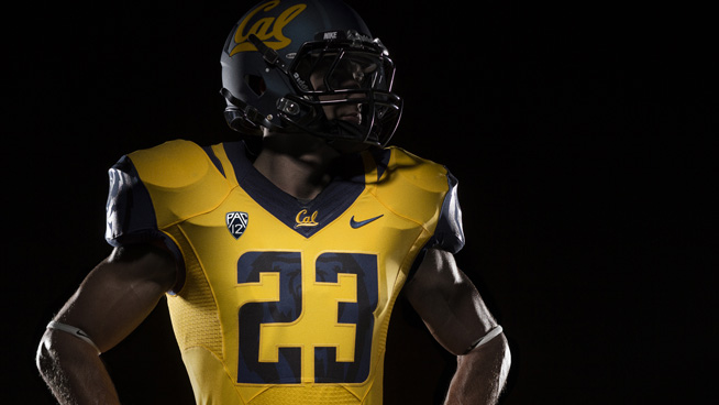
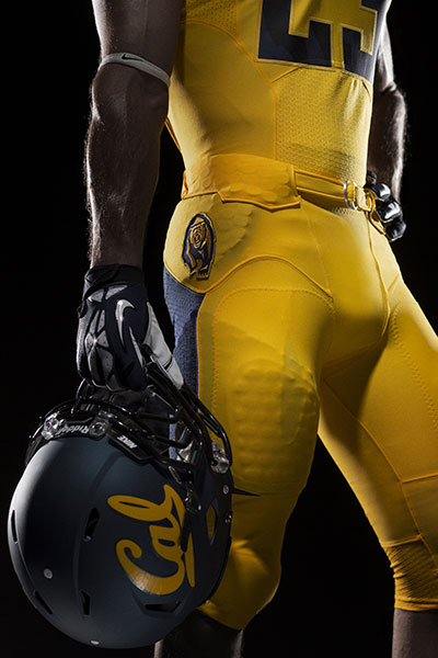


Upvote
0
cincibuck
You kids stay off my lawn!
Black bear logo on dark blue sleeve. Real impressive all the way to row three. But then what did you expect from the home of Roy "Wrong Way" Riegles?LovelandBuckeye;2327603; said:Pics from my previous post above.


Hate to say it, but this kind of crap makes me appreciate the Yankees. Get a winning design and stick with it, let the uniform become your logo.
Upvote
0

