• Follow us on Twitter @buckeyeplanet and @bp_recruiting, like us on Facebook! Enjoy a post or article, recommend it to others! BP is only as strong as its community, and we only promote by word of mouth, so share away!
  • Consider registering! Fewer and higher quality ads, no emails you don't want, access to all the forums, download game torrents, private messages, polls, Sportsbook, etc. Even if you just want to lurk, there are a lot of good reasons to register!

Uniforms (Nike, Under Armour, Adidas, etc....)

eobuck;1755269; said:
Virginia Tech Pro Combat

uniyd.jpg


BlackJersey.jpg

Good lord, even FUBU would be ashamed of that thing. :shake:

Buckeye89Fan;1755549; said:
Adidas??? If they switched to anything I wouldn't mind Under Armour. Adidas has soccer on lock down, their miles behind the competition in football.

How is addidas "behind"? Their outfitting of scUM and ND notwithstanding, how are they a lesser manufacturer than Nike or UA?

Reebok is owned by adidas, and they do all of the NFL uniforms. It seems far-fetched that the NFL would be using sub-standard items.
 
Upvote 0
How is addidas "behind"? Their outfitting of scUM and ND notwithstanding, how are they a lesser manufacturer than Nike or UA?
1) Fan apparel isn't as sharp as UA/Nike most of the time, and that perception trickles over
2) They often get more of the second tier uniforms, so that perception factors into it as well
Reebok is owned by adidas, and they do all of the NFL uniforms. It seems far-fetched that the NFL would be using sub-standard items.
Reebok does a great job with the NFL uniforms. The quality and lines are a lot better than what Adidas seems to produce for college.

Adidas is never that bad (though their squiggle maize on the road unis is a little dumb), they just usually aren't that great either.
 
Upvote 0
Maryland is a unique program in that they have 3 official colors....not 2 like the rest of the college world. And believe me, it's a big deal to include enough gold, black, and red that people see the same colors as on the state flag of Maryland.

NFBuck;1755627; said:
Auburn, I would agree on. Maryland, disagree strongly...

images


alg_football.jpg


too much piping and just too "busy" all around. Then there's this doozy...

texas_tech_smu_football_harrell.jpg


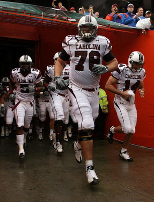
Just looks like a team screaming "look at me!"...again, too busy and awkward for me. South Carolina is another example...

gamecocks.jpg


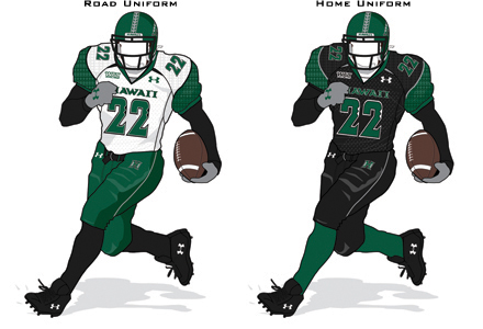
Under armour just tries to cram too much into their designs IMO. Not to mention they're a big fan of the unicolor look which sickens me.


It's all about the $$$, my friend. Sadly, we're about to find out first hand on something much more important than uniforms right here.
 
Upvote 0
DaveyBoy;1755708; said:
Maryland is a unique program in that they have 3 official colors....not 2 like the rest of the college world. And believe me, it's a big deal to include enough gold, black, and red that people see the same colors as on the state flag of Maryland.

Jerseys still look like shit though. :p
 
Upvote 0
Rugger;1755712; said:
I don't think Maryland's uniforms look bad at all. They're not great, but certainly not the among the worst I've seen.
To each his own, but I think they're among the worst. I HATE that stupid oversized tiger striping down the side and all the piping that is a common trait in nearly all of their uniforms...

5315947.jpg

fb_uniform2.jpg

image_7373221.jpg


and the worst offender (IMO), Maryland again:


:sick1:

I guess they just look like Arena League uniforms to me...
 
Upvote 0
NFBuck;1755581; said:
They did a good enough job keeping scUM and NDs classic style with very little tinkering...I'd be okay with that. They also don't insist on this pro combat nonsense. Nike seems intent on turning everything into a rap video with cleats and I do not trust them in the least. When Oregon is your poster program and they wear the [censored] they do, you've officially jumped the shark.

As for Under Armour, their uniforms are absolutely hideous IMO...

Michigan doesn't need to mess with their home jerseys. The only slight thing I would do is put the M on their jersey and move the Adidas logo to the right. Like how OSU, USC, Wisconsin have their logo on their jersey right below their necks.

The away jerseys. I actually they think they should go back to the maize and blue stripe on the sleeves with the number on the shoulder pads. keep the rest of the jersey white with the numbers/name in blue with maize trimming.

10.86%28solomon%29.jpg


almost like that
 
Upvote 0
y0yoyoin;1756886; said:
vtech's jersey's pull from uniwatch blog....remove if not permitted

vtech.jpg

Might actually be cool if it weren't black, didn't have the blue number outline, and didn't have all the shit in the numbers and whatnot.

So basically, it might be cool if it looked completely different.
 
Upvote 0
buckeyes_rock;1756912; said:
Looking at that VT jersey, I can't help but wonder if the camo is going to be incorporated into the number for the Bucks jerseys. I hope not, because I think those look awful.


i agree...i think the 1943 all red with red helmets could look very very good if done right...but i hate how the Vtech's numbers are and the orange by the shoulder pads...should of just went all black with hokie purple and orange for the numbers...none of this matrix crap inside the numbers...this is why i do not have faith in the OSU Jerseys

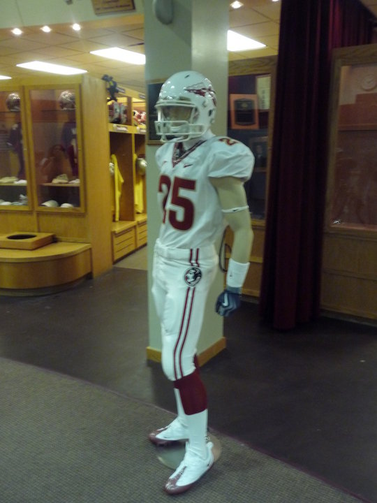
and i actually like these FSU jerseys if they end up doing them

23666_10100208404781993_5257501_59679189_602033_n.jpg
 
Upvote 0
Back
Top