• Follow us on Twitter @buckeyeplanet and @bp_recruiting, like us on Facebook! Enjoy a post or article, recommend it to others! BP is only as strong as its community, and we only promote by word of mouth, so share away!
  • Consider registering! Fewer and higher quality ads, no emails you don't want, access to all the forums, download game torrents, private messages, polls, Sportsbook, etc. Even if you just want to lurk, there are a lot of good reasons to register!

Uniforms (Nike, Under Armour, Adidas, etc....)

Is my monitor jacked up or do these look more purple-ish?

Thought it was a Northwestern jersey until I stopped to read the post.
They've always been a little purple, at least recently. That's ok when it's the foundation to highlight vibrant and iconic gold. It sticks out when you're trying to out Adidas in the "we don't do alternates very often" game.
 
Upvote 0
Good job, Pitt.


A good job indeed. Avoided the all too common overdo.

Considering their colors, they're pretty sharp, but I'd like to see them take it to the next level with a video helmet with this as the logo on both sides:

889788.gif
 
Upvote 0
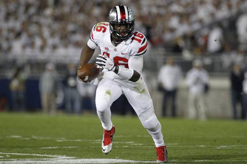
If I became Grand Poobah of The Ohio State University, these would be our football uniforms. Home, away, that's it.

Away (exaggerated stripes, green leaves, white pants)

hi-res-e1ff14aeef0c2f0bdc4c20e336d9c8f3_crop_exact.jpg


Home (traditional leaves, black numbers on shoulders, gray stripes on sleeves, gray pants)

GettyImages-461463006.jpg
The away unis should keep the current helmets and pants (still think they should match the helmets in shade), go back to the same late '60s early '70 gray stripes on the jerseys (like you have for the home jersey), while using the larger block scarlet numerals with gray outline like in your example photo.

Fpr the home unis, the only thing I'd like to see one time is the numerals be a little larger and have them gray with white trim (oh, as I mentioned for the road unis, have the pants shade of gray match the helmets). If those didn't look better than the unis for the 2014 NC game, then revert to the NC unis.
 
Upvote 0
Back
Top