NUTS4theBUCKS28
"C" is for Suspension
Bucknut24;2260681; said:umm, thats what the pics show
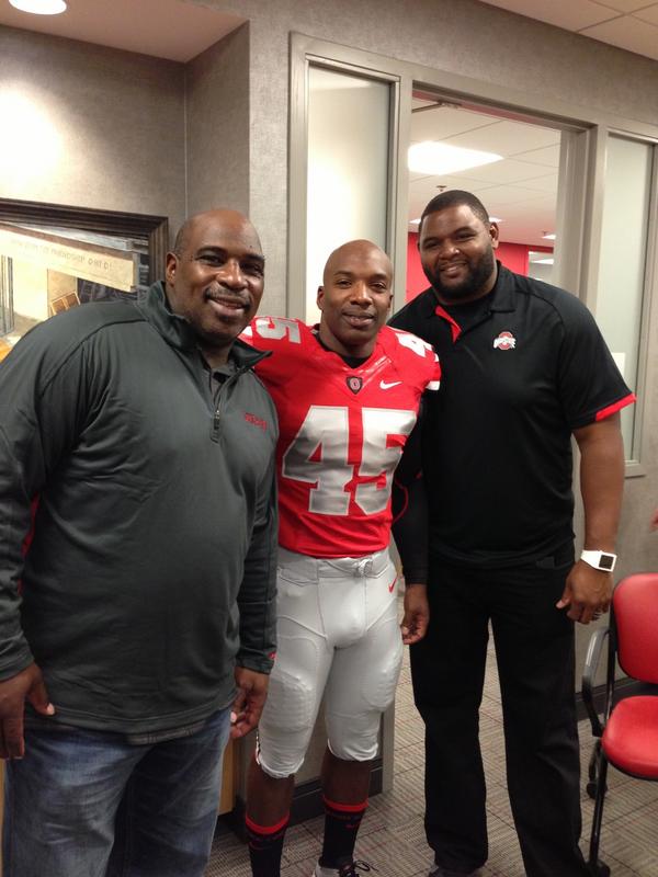
that's not the greatest pic in the world, but trust me, they were gray
Upvote
0
Follow along with the video below to see how to install our site as a web app on your home screen.

Note: This feature currently requires accessing the site using the built-in Safari browser.
Bucknut24;2260681; said:umm, thats what the pics show
cincibuck;2260702; said:I hope we're not back to white pants again.
cincibuck;2260702; said:I hope we're not back to white pants again.
JBaney45;2260616; said:Hell they could even make the leaves bigger, like archie griffin style size..fit in with the theme

From 2005:jwinslow;2260718; said:There are things I don't like about it, like the oversized helmet stripe, but with a regular helmet and shiny pants, these should be our base uniforms.
the Jersey numbers look like the ones I put on Erik Haw seven years ago. Love them.

jwinslow;129266; said:Edit:
This is the only jersey modification I would make (other than restoring the silver pants and old pant stripes... which isn't really a 'change'):


